Typography - Task 3: Type Design & Communication
14/5/2021 - 4/6/2021 / Week 7 - Week 10
Woo Yau Ka / 0355281
Typography / Bachelor of Design (Hons) in Creative Media
Task 3A: Type Design and Communication
Typography / Bachelor of Design (Hons) in Creative Media
Task 3A: Type Design and Communication
LECTURES
All lectures 1 to 6 completed in Task 1 Exercise
WEEK 7: Typography Task 3 briefing and demo
In this week's lesson, Mr. Vinod gives us a brief introduction to Task 3 and demonstrates how to build a typeface using shapes and strokes.
In class, Mr. Vinod let us try to use different tools to draw different letters and circles and use the same angle and strength to prevent different results.
 |
| Fig. 1.1 Deconstructed "r" |
 |
| Fig. 1.2 Guidelines |
We have to ensure our font design is following the basics of Typography:
- Ascender height.
- Capital height.
- Mean/median line.
- Baseline.
- Descender line.
Adobe Illustrator settings:
- Artboard: 1000 × 1000 points.
- CMYK.
- X-height must be 500 points (make a shape 500 × 500 pt).
- Ascender and descender line must be within the 1000 × 1000 pt artboard.
- If the design's x-height exceeds 500 pt, the design must be reworked. The same goes for the ascender and descender if they exceed.
- Overshoot: Optical/technical reasons.
- How to decide counter space: Same amount of space (thickness) between the 2 stems/half the size of a stem.
- Unite base shapes with pathfinder.
WEEK 8: Independent Learning Week
Week 8 is an independent study week, so there are no physical or online classes. So this week we continue with the writing activity from week seven. We chose our favorite one out of 5 options for different tools and continued to practice and explore.
 |
| Fig. 1.3 |
WEEK 9:
In week 9 we continue with the writing activity of Task 3. Mr. Vinod started by explaining to us how we will proceed with task 3. We will enter the digital stage. Mr. Vinod then showed us and demonstrated how to digitize the letterforms using Adobe Illustrator.
*Suggested us to attend this week's lecture entitled "BARANG2 SENDIRI S'JA – Labeling of Commercial Vehicles in Malaysia" by Ms. Low Hsin Yin.
WEEK 10:
In week 10, Mr. Vinod checked our digitization from last week. He then told us that writing is only the beginning of the type design process. In order to design typefaces, we need to refine what we have digitized. Then, we started work on perfecting the digitized letter and Mr. Vinod gave us some feedback/suggestions and ideas.
WEEK 11:
In week 11, Mr. Vinod asked us to check the e-portfolios of other peers and provide them with feedback. We had to pick 4 of our peers (2 locals, 2 foreigners) and look at their electronic profiles and tell them what we noticed. We then took a brief look at the poster of our typeface. Posters should show our fonts, expressing our own phrases or sentences with the limited alphabet we have designed. We have to follow the rules, the size of the poster must be A4, there should be 6-7 characters, we should not use more than one font size, the information should be 12 pt, Helvetica or Univers LT Std.
WEEK 12:
Mr. Vinod explained to us and showed us an example of the final submission for task 3 and what should be included in the blog. Afterwards, Mr. Vinod gave us feedback on a poster featuring our typeface. We had to make sure posters followed the rules set out last week.
INSTRUCTIONS
Task 3: Type Design and Communication
1. Research on type design
 |
| Fig. 2.1 Typography basics |
Our typography must adhere to typographic guidelines such as baseline, median, ascenders, and descenders, as well as the typographic basics shown in the image above. We should pay attention to these when creating the sketch.
Research and Deconstruction
Out of 10 fonts, I decided to dissect the Futura Std font.
Art Deco typography is characterized by geometric shapes, often elongated letters, and sometimes many ornate decorative details. The Art Deco style is by A.M. Cassandre. In 1929, he created the Bifur typeface. It combines very thick strokes with thinner horizontal or vertical lines. He also designed the Acier Noir and Peignot typefaces.
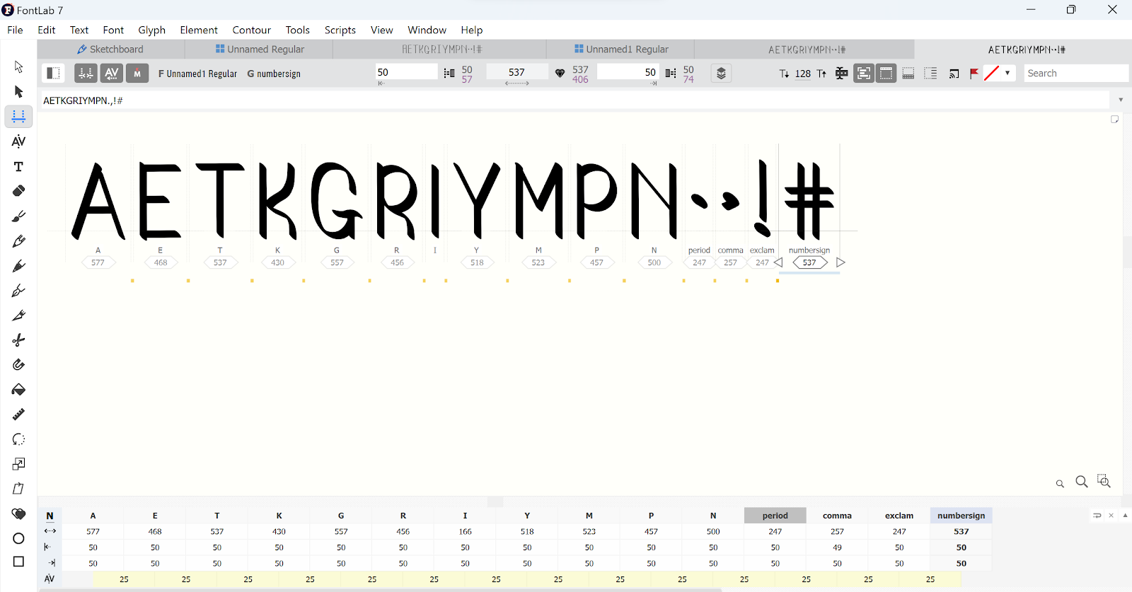
The five tools I use are Superfine, Standard board, Brush pen, Calligraphy 1.0 and 3.0.I used them to draw the same AETKGRIYMPN, and finally I chose the Standard board for the next step.
I repeated drawing of AETKGRIYMPN several times for the characters I chose, in order to find the best characters to evolve digitization.
 |
| Fig. 2.2 Overshoot |
Even though all letters seem to be the exact same height, the round shapes are slightly bigger. If the letters with rounded parts are not slightly bigger, the letters will seem disproportional. This is because rounded shapes appear smaller than geometric shapes.
Out of 10 fonts, I decided to dissect the Futura Std font.
 |
| Fig. 2.3 |
Futura is also one of the examples of Art Deco Typefaces. Created in 1927, by Paul Renner. It was a representative of the Bauhaus ideology, function over form. By applying this ideology, it produces a font without extraneous decorative components. It fits into the Bauhaus geometric aesthetic which peaked until the 30s. Here are a few things I found from the deconstruction:
 |
| Fig. 2.4 https://pin.it/4fj0mZh |
 |
| Fig. 2.5 https://pin.it/78kk9jV |
 |
| Fig. 2.6 https://pin.it/PVm7EDt |
Art Deco typography is characterized by geometric shapes, often elongated letters, and sometimes many ornate decorative details. The Art Deco style is by A.M. Cassandre. In 1929, he created the Bifur typeface. It combines very thick strokes with thinner horizontal or vertical lines. He also designed the Acier Noir and Peignot typefaces.
Sketches:
 |
| Fig 3.1 |
The five tools I use are Superfine, Standard board, Brush pen, Calligraphy 1.0 and 3.0.I used them to draw the same AETKGRIYMPN, and finally I chose the Standard board for the next step.
 |
| Fig. 3.2 |
Digital exploration:
 |
| Fig. 4.1 first digital |
After getting Mr. Vinod's opinion, I changed the choice of letters and used 15pt, round to make the digital version instead.
| Fig. 4.2 |
The image above is a digital version I have recreated.
| Fig. 4.3screen grab of Ctrl + y |
 |
| Fig. 4.4 the word 'A' |
 |
| Fig. 4.5 the word 'E' |
 |
| Fig4.6screen grab of character map. |
 |
| Fig4.7The first try of kerning sentence. |
On the first try, I entered the wrong spacing to create the font, so I tried again.
 | ||
Fig4.8 screen grab of kerning sentence.
|

FINAL:
| Fig5.1 Ai generated construction on art board. (20.6.2023) |
 |
| Fig5.2 Ai generated A4 poster. (20.6.2023) |
Fig. 6.1 Final Task 3A: Type Design and Communication "Diadem Demo" - PDF
Fig. 6.2 "Diadem Demo" Typo Poster A4 - PDF
FEEDBACK:
Week 8
ILW
Week 9
General Feedback: Choose the best one to make a digitized version.
Week 10
General Feedback: Improve sketches during digitization.
Specific Feedback: Use a pen and graphics to outline the angles of the bends.
Week 11
General Feedback: Try to remake the digitized version.
Specific Feedback: consider changing the font to 15pt, round.
Week 12
Absent
REFLECTIONS
Experience
Overall, this assignment was a good experience, I gained a deeper understanding of type design, which made me appreciate them more, because the process of creating type is not simple.
Observations
I have observed that designing typefaces is a difficult task and we need to have a lot of analysis and research to support us in this assignment.
Findings
I discovered that we need to consider many rules and factors and approach this task with a relaxed mind.
FURTHER READING
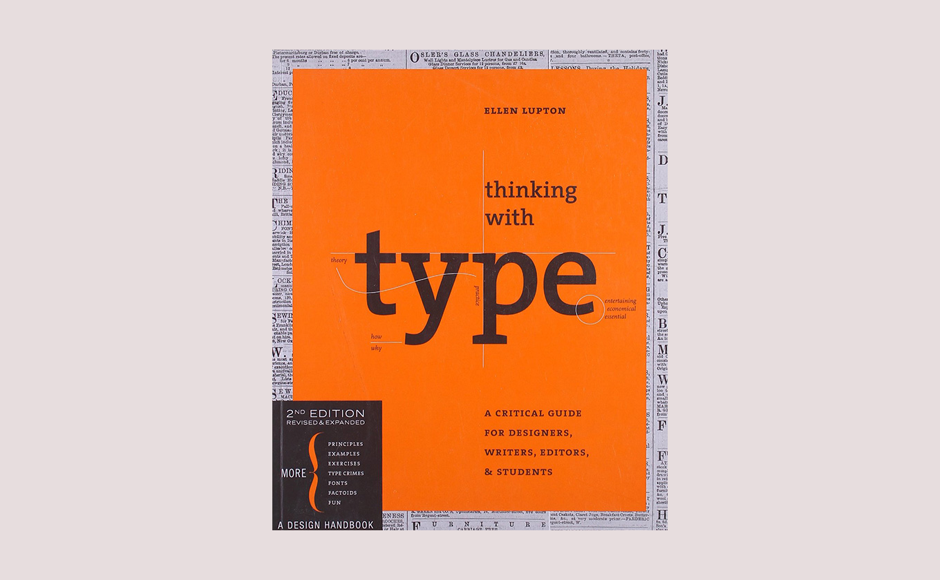 |
| Fig6.1 Thinking of Type |
By Ellen Lupton · 224 Pages · 2004 (Revised in 2010)
The pages are filled with engaging, full-color examples, and it’s a quick, easy read. It’s written for more of a general audience that includes writers and editors, rather than just designers. The focus isn’t on the web as much; it’s just more of an all-around typography primer.


留言
發佈留言