Creative Brand Strategy / Task 3: Campaign Branding
Woo Yau Ka / 0355281
Creative Brand Strategy / Bachelor of Design (HONS) in Creative MediaTask 3: Campaign Branding
Task 3: Campaign Branding
 |
| Figure 1.1 Final Logo |
Since the logo does not need to be changed, we decided to use the brand's previous logo.
 |
| Figure 1.2 Final Packaging design |
 |
| Figure 1.3 Final Packaging design |
2.Poster
 |
| Figure 1.4 Poster |
In the poster, I chose to add explosion elements to express that the chocolate in the center contains exploding candy ingredients, and at the same time, I emphasized diversity in the use of colors.
 |
| Figure 1.5 Poster Mock-up |
 |
| Figure 1.6 Environment Graphic |
4.Merchandise
 |
| Figure 1.7 Final Merchandise 1 |
 |
| Figure 1.8 Final Merchandise 2 |
 |
| Figure 1.9 Final Email |
Focused lighting allows viewers to focus more on the center point and content. After receiving feedback, I changed the content to brand story
 |
| Figure 2.0 Email Mock-up |
2.Website
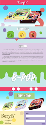 |
| Figure 2.1 Final Website |
This is a scrolling webpage. The upper part is the homepage and introduction, and the lower part is the ordering store part.
 |
| Figure 2.2 Website Mock-up |
3.Social Media
 |
| Figure 2.3 Final Social Media |
 |
| Figure 2.4 Social Media Mock-up |
Figure 2.5 Final Video
Final Submission
WEEK 6 29 OCTOBER 2024
FEEDBACK
1. Don’t use too much green 2. The logo should be placed first 3. The explosion effect is not too prominent
WEEK 7 05 NOVEMBER 2024
FEEDBACK
1. Change the font of the content 2. Do not use A4 size to design posters 3. For emails, the brand name can be placed in the lower right corner 4. Elements should be integrated for easy use
WEEK 8 12 NOVEMBER 2024 (INDEPENDENT LEARNING WEEK)
WEEK 9 19 NOVEMBER 2024
FEEDBACK
1.Should make more posters.
2.The packaging design should be labeled on the back.
3.Change the background of the video.
WEEK 10 26 NOVEMBER 2024
FEEDBACK
absent
WEEK 11 03 DECEMBER 2024
FEEDBACK
1.Add the flavors text to the video.
2.Extended the video.
3.Design one more merchandise.
4.Type the store’s location in post 2.
5.Type the URL of the website in post 4.
6.The last part of the video shows b-pop.
7.Don’t use the same font as b-pop in post.
WEEK 12 10 DECEMBER 2024
FEEDBACK
1.Add the URL at the end of the video.
2.Complete ppt and mock-up.


留言
發佈留言